Eurojackpot Vrouwen Eredivisie
With Eurojackpot as the new partner, the moment was right for a visual and mental repositioning. The challenge: capturing the speed, character and future of women's football in one recognisable identity.
We started with the badge: a fusion of both logos into one powerful shape. Around it we built a dynamic visual identity with bold colours, shapes and typography that feels recognisable everywhere.
The league got a fresh, professional look that matches the growth of women's football. The visual language is flexible enough for every channel, yet unmistakably Women's Eredivisie.
From badge to colour palette, typography and templates: a complete visual identity, including guidelines and a rollout across social, campaign material and scoreboards. All designed for consistency and recognition.
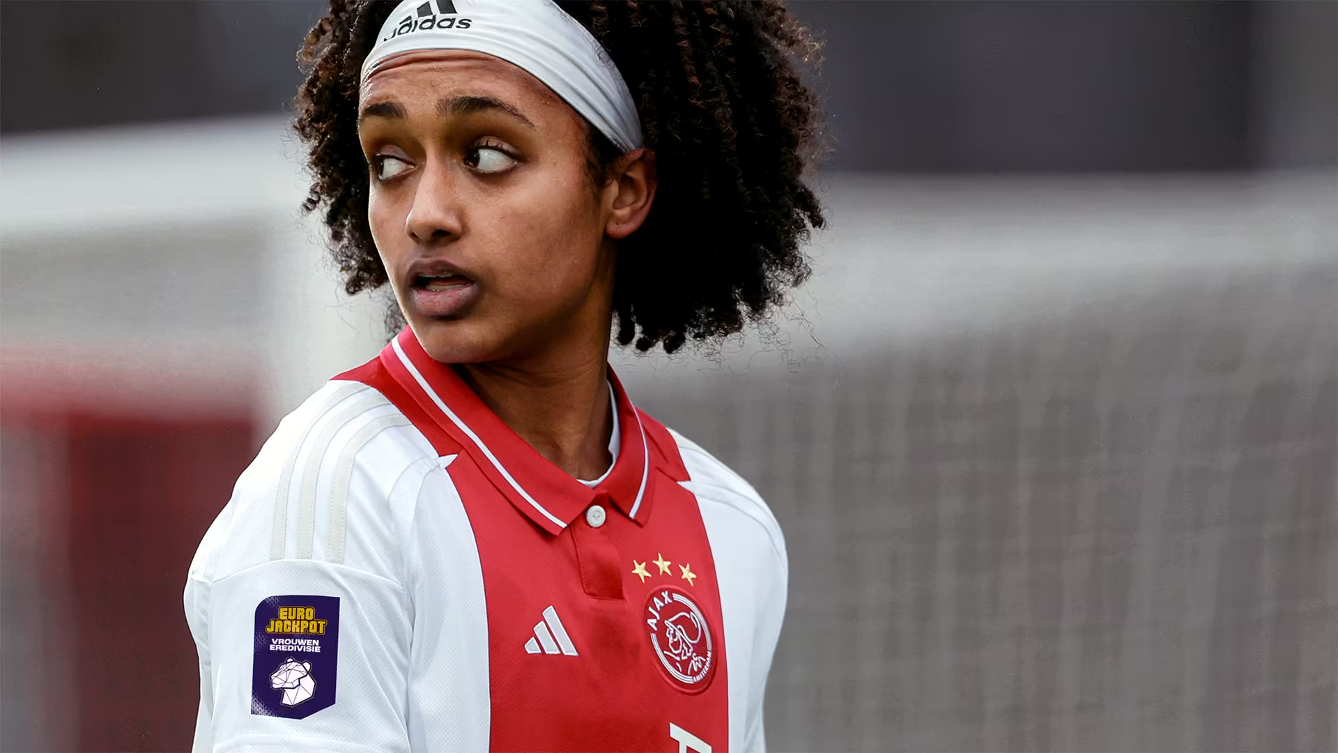
A new name on the shirt. A new energy in the league. From now on, the Women's Eredivisie and Eurojackpot share one badge, and one story.
The badge shape is no coincidence. We looked at the logos of both brands, brought the shapes together and turned them into one powerful brand shape. That shape became the basis for the entire visual identity. Everything had to breathe what the league is: dynamic, clear, ready for the future. Fresh, but with a recognisable signature.


Collaborate?
in crime