Cultureel hart van Amsterdam
Give a recognisable spot in Amsterdam-West a visual identity that shows what it is today: living heritage, in the middle of the city, for everyone.
Starting from its past as a former tram depot, we developed a visual system built around connection between people, neighbourhoods and stories.
The new identity immediately gave De Hallen a recognisable face. The concept has been widely embraced by partners, tenants and the visitors who walk in every day.
We developed the creative concept, the logo, the colour system, templates, typography and tone of voice. We also advised on on-site applications and the digital translation of the brand.
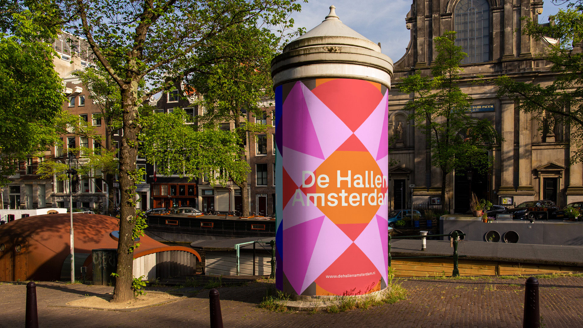
De Hallen is a place where worlds come together every day. Inside a monumental former tram depot in Amsterdam-West you meet culture, creativity and more than three million visitors per year. We developed a new visual identity that honours its past and is ready for the future.


The design goes back to De Hallen's origin as a tram depot. Every tram line in Amsterdam has its own colour and shape; simple, recognisable, inclusive. That idea formed the basis of a flexible system of shapes and colours in which the diversity of the city becomes visible.


Collaborate?
in crime